
What Predicts a Big Crypto Move? I Labeled 16,726 Extreme-Volume Events to Find Out

AnomIQ’s simulator lets me replay a full year of tick-level trades through the same pipeline that runs the live scanner. That matters because I do not have to turn one clean chart into a theory. I can ask a question against a year of market behavior and see what breaks.
I have already used that setup to testmean reversion on single assets and cointegrated pairs. Both failed, but for different reasons. This time I did not start with a signal. I found every extreme volume event in the dataset, labeled each one by what price actually did afterward, and then asked which statistics separated the events that moved from the events that did not.
The answer split in a way I did not expect.
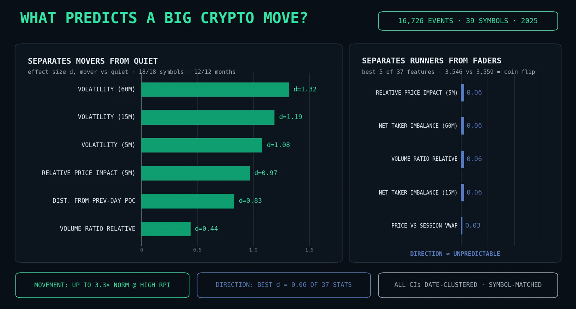
Direction: nothing. Not weak. Nothing I measured separated up-resolutions from down-resolutions.
Movement: yes. Five conditions separated movers from non-movers in essentially every symbol and every month I could test.
That negative result is not a footnote. It is half the point.
The Study Design: Label First, Then Search
I began with labels, not a favorite indicator.
First, define what counts as a useful move. Then find every event that produced one. Only then compare every statistic available at the event bar against the flat cases.
The raw material was 16,628,186 one-minute observations across 39 Binance USDT perpetual symbols covering all of 2025, produced by replaying exchange tick data through AnomIQ’s live calculation pipeline. An “extreme imbalance event” was any minute where the gap between the Buy Volume Z-Score and Sell Volume Z-Score on the 5-minute window reached that symbol’s own 99.8th percentile. That is one-in-five-hundred territory, calibrated per symbol so BTC and a smaller alt are judged against their own histories.
After collapsing consecutive qualifying minutes with a 4-hour separation rule, the dataset contained 16,726 independent episodes: 8,413 buy-dominant and 8,313 sell-dominant.
Each episode was labeled by its price path over the following 12 hours, measured from the first price at least 60 seconds after the signal. No same-bar entries. The label was assigned in the direction of the volume imbalance:
| Label | Definition (basis points) | Count | Share |
|---|---|---|---|
| Runner | ≥250 with the imbalance, ≤125 against | 3,546 | 21.2% |
| Fader | ≥250 against the imbalance, ≤125 with | 3,559 | 21.3% |
| Quiet | neither direction reaches 100 | 648 | 3.9% |
| Mixed | everything else | 8,973 | 53.6% |
The table creates two tests.
Runner versus fader asks: can anything predict direction?
Runner-plus-fader versus quiet asks: can anything predict movement?
For each of 37 statistics measured at the event bar, I computed the effect size (Cohen’s d) between groups. The feature set covered every 5-minute, 15-minute, and 60-minute rolling metric, VWAP distances, volume profile location, Bitcoin correlations, liquidity, and volume pacing. I also counted stability two ways: how many individual symbols kept the same sign, and how many individual months kept the same sign.
A statistic that only works because of one crash week fails the month count. A statistic that only works on thin symbols fails the symbol count.
Result 1: Direction Was a Coin Flip
Nothing measurable at the moment of an extreme volume event predicted which way it would resolve.
The split was 3,546 runners and 3,559 faders. Extreme buy-side imbalance was about as likely to precede a 250-basis-point fall as a 250-basis-point rally. Sell-side imbalance behaved the same way.
Then I ranked the 37 candidate statistics, with signed features oriented so that aligned with the imbalance was positive. These were the best five by absolute effect size:
| Statistic at the event | Effect size d | Symbol consistency | Month consistency |
|---|---|---|---|
| Relative Price Impact (5m) | −0.06 | 24/38 | 7/12 |
| Net Taker Imbalance (60m) | +0.06 | 25/38 | 8/12 |
| Volume Ratio Relative | +0.06 | 23/38 | 7/12 |
| Net Taker Imbalance (15m) | +0.06 | 24/38 | 6/12 |
| Timeframe Volatility (60m) | −0.05 | 24/38 | 7/12 |
An effect size of 0.06 is noise. The two distributions overlap almost completely, and 24-of-38 symbol consistency is close to what a fair coin gives you by accident.
The more obvious direction candidates did no better. Price relative to session VWAP: nothing. Price relative to a volume-weighted trend anchor: nothing. Distance from the previous day’s point of control, signed by the imbalance: nothing. The day’s move so far: nothing.
This rejects a narrower claim than it might look like. It does not say markets are unpredictable. It does not say tape data is useless; the rest of this post shows the opposite. It says the resolution direction of an extreme volume event was not encoded in the event itself.
That makes market-structure sense. Every executed trade has a buyer and a seller. Every serious participant sees the same tape within milliseconds. Short-horizon direction from shared public flow is the most competed edge in crypto, so a tape-only indicator does not get to keep that edge for long. Mine included. That is why I test rather than assert.
Direction might still live somewhere else: order book depth, funding and positioning, liquidation flows, options structure, or slower cross-market context. That is a different research thread.
Plain version: a burst of aggressive volume does not tell you which way price goes next, no matter how convincing the chart looks. It does tell you something else.
Result 2: The Outsized-Move Fingerprint
Events that later moved 250+ basis points, in either direction, looked different from events that went quiet.
The difference held in every symbol with enough data and in all twelve months of 2025. The movement comparison, 7,105 movers against 648 quiet events, produced effect sizes far larger than anything in the direction search:
| Statistic at the event | Effect size d | Mover mean | Quiet mean | Symbol consistency | Month consistency |
|---|---|---|---|---|---|
| Timeframe Volatility (60m) | +1.32 | 1.66 | 0.61 | 18/18 | 12/12 |
| Timeframe Volatility (15m) | +1.19 | 1.24 | 0.44 | 18/18 | 12/12 |
| Timeframe Volatility (5m) | +1.08 | 0.97 | 0.34 | 18/18 | 12/12 |
| Relative Price Impact (5m) | +0.97 | 0.118 | 0.048 | 18/18 | 12/12 |
| Relative Price Impact (15m) | +0.88 | 0.44 | 0.18 | 18/18 | 12/12 |
| Relative Price Impact (60m) | +0.88 | 1.08 | 0.48 | 16/18 | 12/12 |
| Distance from previous-day POC (absolute) | +0.83 | 3.26 | 1.29 | 17/18 | 12/12 |
| Correlation to BTC (24h) | −0.75 | 0.62 | 0.76 | 8/18 | 11/12 |
| Volume Ratio Relative | +0.44 | 118 | 86 | 18/18 | 12/12 |
The pattern is not subtle. The outsized-move fingerprint is five conditions showing up at the same time:
- Volatility is already elevated on the 5-minute, 15-minute, and 60-minute windows.
- Relative Price Impact is high, so flow is moving price instead of being absorbed.
- Price is far from the previous day’s point of control.
- Volume is running hot relative to the same time yesterday.
- The market is less tied to Bitcoin, though this one is weaker as a timing signal.
Here is why each one matters.
Multi-window volatility (d = 1.08 to 1.32). Turbulence clusters. That is one of the oldest facts in volatility research, and it was the largest effect in this study. An extreme volume event landing inside an already-turbulent regime is not the same event as one landing in a calm regime. Effect sizes above 1.0 mean the mover and quiet distributions barely overlap.
Relative Price Impact (d = 0.88 to 0.97). This deserves its own section because it replicated across three independent event definitions and produced a dose-response curve, not a single convenient threshold.
Distance from the previous day’s point of control (d = 0.83). Movers were 3.26% from the prior day’s POC on average. Quiet events were 1.29% away. Price near yesterday’s accepted value has a dense zone of prior transactions around it. Disagreement gets absorbed there. Price far from that zone is trading in territory the market has not accepted, where a shock has less structure to push against.
Volume Ratio Relative (d = 0.44). Movers were doing 118% of their volume pace at the same time yesterday. Quiet events were doing 86%. Attention was already elevated before the event.
Correlation to BTC (24h) (d = −0.75, with an asterisk). Movers were less correlated to Bitcoin, but the symbol consistency was only 8/18. That means this is substantially a between-coin effect: coins that live less tethered to BTC produce more large idiosyncratic moves. It held in 11 of 12 months, so I am not ignoring it. But unlike the other four, it is weak as a within-coin timing signal. Leaving out the weakest part of a finding is how research starts lying to itself.
None of these five conditions tells you direction. The fingerprint says a larger-than-normal move is likely from here. It is silent about the sign.
The Strongest Single Statistic: Relative Price Impact as a Dial
Within extreme-volume events, Relative Price Impact behaved like a dial: the more price moved per dollar of flow at the event, the larger the next move was relative to that symbol’s own normal behavior.
I tested this against a companion event class: minutes where the Buy Volume Z-Score and Sell Volume Z-Score both exceeded 15 at the same time. That is extreme contested volume, with both sides trading at size. The sample contained 5,146 independent episodes in 2025.
For each episode, I measured the next move as a ratio to that same symbol’s unconditional norm at the same horizon. That keeps a naturally noisy symbol from faking the result. Every confidence interval below is bootstrapped by calendar date, so one crash week cannot carry the table:
| Relative Price Impact at the event | Episodes | Next 4h movement vs symbol norm | Next 24h |
|---|---|---|---|
| Bottom quartile — flow fully absorbed | 1,949 | 0.96× [0.89, 1.02] | 0.96× |
| Middle half | 3,580 | 1.33× [1.19, 1.50] | 1.08× |
| Top quartile — flow displacing price | 1,900 | 1.83× [1.55, 2.18] | 1.31× |
| Top 8.6% (RPI ≥ 0.2) | 723 | 2.20× [1.75, 2.72] | 1.52× |
| Top 1.2% (RPI ≥ 0.5) | 98 | 3.27× [2.33, 4.50] | 1.82× |
Two things matter here.
First, the relationship is monotonic. Each step up the impact scale produced a larger subsequent move, all the way into the 98-event tail. Real effects often look like this. Artifacts usually appear at one convenient threshold.
Second, the bottom row of the mechanism matters more than it looks: extreme contested volume that gets fully absorbed was a non-event. It produced 0.96× normal movement, statistically indistinguishable from nothing special happening.
The common intuition ran backward in this data. Quiet absorption of heavy flow did not precede a large pending move. When contested flow was absorbed, the dramatic tape was already resolved. When the same flow failed to be absorbed, movement followed and persisted for up to a day.
One-sided events showed the same inversion. When one side’s volume z-score was above 10 while the other stayed quiet, deeply absorbed spikes were followed by less movement than the symbol’s norm: 0.69× to 0.85×, the quietest cells in the study. A one-sided burst the book soaks up is a completed transfer. The event was the resolution, not the setup.
The Trap in the Data: Why the Big-Player Story Fails
Extreme-flow events do produce a real average continuation edge in the direction of the flow. You still cannot trade it cleanly, because the edge lives in a rare tail while the typical event goes the other way.
This is the result most likely to mislead a discretionary trader, so the path statistics matter more than the headline. Across all 16,726 episodes, the maximum excursion with the imbalance averaged 15.0 basis points more than the maximum excursion against it. The date-clustered confidence interval was [+2.5, +29.5], so the asymmetry was real. Endpoint returns had hidden it.
Then the trade failed three path checks:
| Path statistic (12h, all 16,726 episodes) | Value |
|---|---|
| Race: hit +50bps with the flow before −50 against | 49.4% [48.5, 50.2] |
| Race: +100 before −100 | 49.3% [48.3, 50.3] |
| Race: +200 before −200 | 50.1% [49.0, 51.1] |
| Median favorable vs adverse excursion (footprint subset, 4h) | 123bps vs 144bps |
Price was not more likely to reach any profit target before the same-size stop. In the most footprint-like subset, concentrated flow that visibly displaced price, the median event travelled further against the flow than with it.
The mean asymmetry came from a small tail of enormous continuation runs concentrated on shock days. Follow-the-flow is a lottery ticket that pays on those days and bleeds the rest of the year. That is exactly the payoff shape a backtest average conceals and a live account discovers.
Methodology Notes, Because the Failure Modes Are the Story
Three checks changed the study before publication. Anyone working with exchange data should expect all three.
- Cold-start z-score artifacts. Rolling z-scores computed in the first bars after a data-feed start or gap have baselines too thin to trust. They blow up exactly where an extreme-event study selects. In the contested-volume event class, 21% of raw qualifying minutes (4,250 of 20,182) were artifacts of this mechanism and had to be excluded by rule: a warm-up window after any series start or multi-day gap, plus a sanity cap far above the legitimate distribution. Without that filter, this post would be describing software behavior, not market behavior.
- Date-clustered inference. Extreme events cluster on the same calendar days, so treating episodes as independent understates uncertainty badly. Every confidence interval above resamples by date, not by event. Several results that looked significant under naive intervals stopped being significant under clustered ones. Those are not in this post.
- Return-weighted concentration. Counting how many events fall on the top days is not enough. You also have to ask what share of the result those days carry. In the direction studies, October 10th, one crash night, repeatedly carried enormous shares of pooled returns while looking harmless by event count. Every claim above survives excluding the top dates. The claims that did not survive are rejected.
The full pipeline runs end-to-end against the replayed 2025 dataset: event extraction, labeling, feature comparison, path measurement, and artifact filters. The numbers above come from those runs without adjustment.
What This Means If You Trade
Use an extreme-volume event as an attention allocator, not a direction call.
In practice:
- Treat contested volume with high Relative Price Impact as a volatility alert. Both sides trading at extreme size while price visibly displaced preceded moves of 1.8× to 3.3× the symbol’s norm over the following hours. That is when spreads widen, stops get run, and volatility strategies have their conditions. In either direction.
- Treat deeply absorbed events as a stand-down signal. Heavy flow with low price impact, one-sided or contested, was followed by normal-to-below-normal movement. The dramatic tape was already resolved.
- Weight the fingerprint, not one statistic. Elevated multi-window volatility, high relative price impact, distance from the prior day’s POC, and hot relative volume each held in essentially every symbol and month independently. Together, they define the highest-energy state this data can identify.
- Do not let the tape tell you direction. Sixteen framings, 37 statistics, and one outcome-labeled search all pointed to the same answer: the resolution direction of an extreme volume event was not predictable from trade data in 2025. Bring direction from somewhere else, such as positioning data, cross-sectional structure, or your own thesis. Or trade the volatility itself.
Every statistic in this study, from volume z-scores to Relative Price Impact, Net Taker Imbalance, volume profile distances, and correlations, is computed live by AnomIQ. The fingerprint conditions above can be composed directly as scanner filters.
The tape is good at telling you where to look. It is disciplined about refusing to tell you which way.